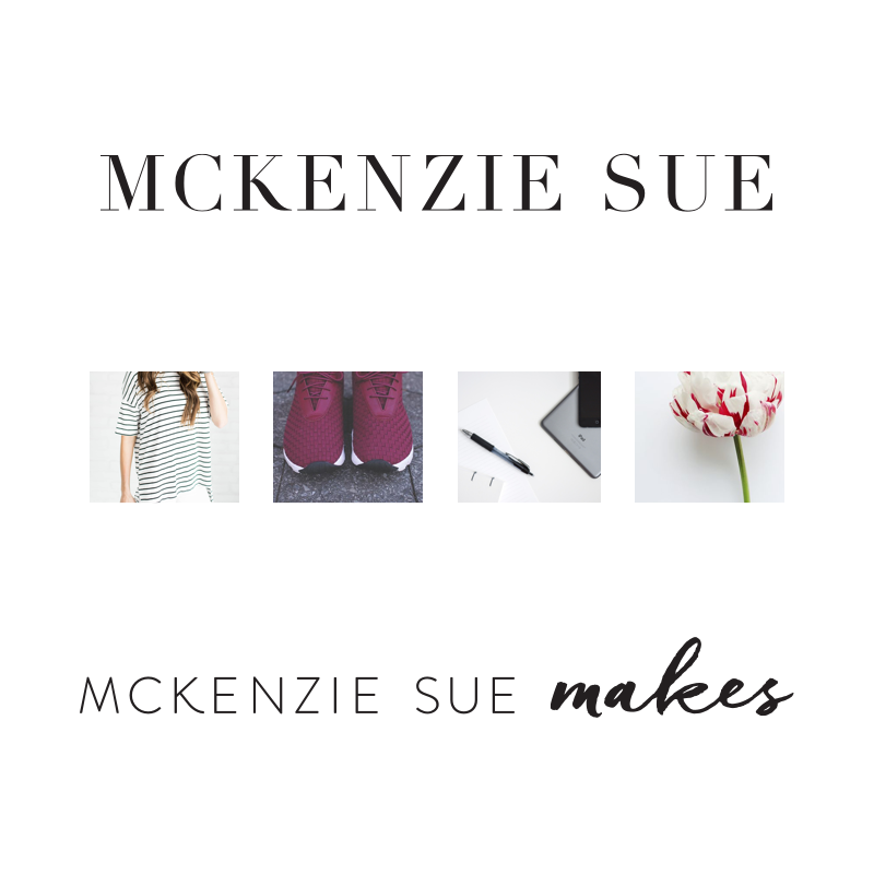
I decided to take some time to focus on my personal branding which usually gets pushed aside. I started with a moodboard which is always fun and then tried a few directions until I came to this one. I wanted my freelance ‘McKenzie Sue’ branding to be professional, but almost identical to my ‘McKenzie Sue Makes’ while still letting my blog header have a little more fun. The spacing between the a and k on makes is already bugging me but I think this branding will stay with me for a while. Here are a few headers I had been using previously, you can definitely see the transformation to more simplicity.

I love all the little icons, I am trying to figure out a way for me to still use some of these elements. I was immensely inspired by a Pinterest logo (which means a lot of it is copied) so I just didn’t feel right using it.

I used elements like these in my wedding invitations and I just loved them so I wanted to implement it into my blog. Except I don’t know why I chose the funkiest looking part of my invitation on those left and right border, I definitely just tried to throw something together a little too quickly.
I’m excited to see where my freelance site and blog take me, I have already figured out I am not good at writing, as well as posting consistently, but I’m glad to have a space in the world of internet that I can call mine 🙂


